G2A
Tabuľky
Kontakt: palkovaj@yahoo.com
Dátum poslednej aktualizácie ... 27.januára 2008
12. Rozhodovanie II a náhodné hodnoty
13. Informácie a ich kódovanie
 MYP1 |
MYP2 |
MYP3 |
MYP4 |
MYP5 |
G2A
MYP1 |
MYP2 |
MYP3 |
MYP4 |
MYP5 |
G2A
We have already used two charts - bar chart and pie chart in the last lesson; now we will have a look at two more that may seem similar at first: linear chart and dot chart.
1. Linear chart - to show increasing or decreasing tendencies
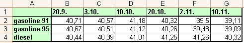
Copy the table with the data about the changes of prices of gasoline and diesel on months october and november 2007 (if you wish, you may try to find newer data on internet). Create a linear chart for all three types of propellants to show how the prices were falling and increasing.
2. Dot chart - used for mathematical and scientifical charts - to display functions
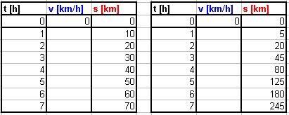
Create a table of measurements of time and distance according to the image and calculate missing speeds. Create a dot chart to show a v-t graph and a d-t graph for each table.
1. Linear chart - to show increasing or decreasing tendencies
Copy the table with the data about the changes of prices of gasoline and diesel on months october and november 2007 (if you wish, you may try to find newer data on internet). Create a linear chart for all three types of propellants to show how the prices were falling and increasing.
2. Dot chart - used for mathematical and scientifical charts - to display functions
Create a table of measurements of time and distance according to the image and calculate missing speeds. Create a dot chart to show a v-t graph and a d-t graph for each table.